Think Pink (+ Blue)
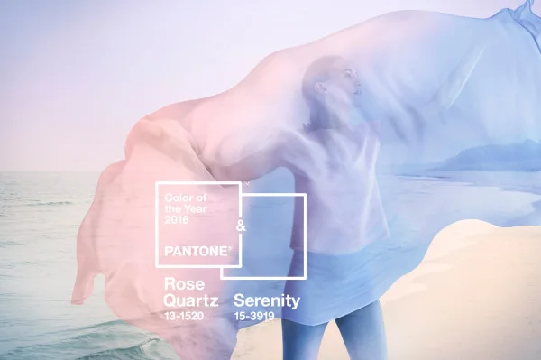
Last week color-lovers awaited the announcement of Pantone's Color of the Year pick for 2016, only to find out TWO colors had been chosen! The long awaited...
Rose Quartz + Serenity
Photo c/o Pantone
I've heard a lot of mixed reviews about this choice, mostly criticizing the reminiscent "nursery" + "baby" colors. However, once you move beyond the stereotypical judgments I think you'll come to see these colors in a new, modern way. I've always loved these colors, especially together, as they evoke romance + peace. Even though I tend to lean more towards bright + saturated colors, I love that these colors can be reinvented into a new "neutral". As a stylist I'm excited to see these colors influence
the home + wedding styling industry
I was also impressed by Pantone's reasons behind their choice. Here are Pantone's guiding words to explain their choice:
"Joined together, Rose Quartz and Serenity demonstrate an inherent balance between a warmer embracing rose tone and the cooler tranquil blue, reflecting connection and wellness as well as a soothing sense of order and peace."
It's exciting to see a large + influential company embrace our need for peace amongst our chaotic modern lives. By choosing these colors they acknowledge color as a huge contributor to our day to day lives, which is something I've always believed.
Photo c/o Pantone
Another exciting reason for choosing this color comes from our cultural movement + acceptance of gender equality:
"This more unilateral approach to color is coinciding with societal movements toward gender equality and fluidity, the consumer's increased comfort with using color as a form of expression, a generation that has less concern about being typecast or judged and an open exchange of digital information that has opened our eyes to different approaches to color usage."
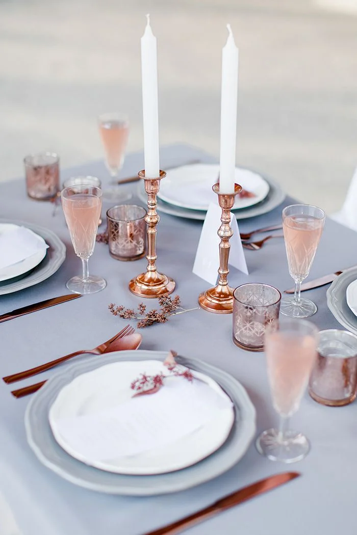
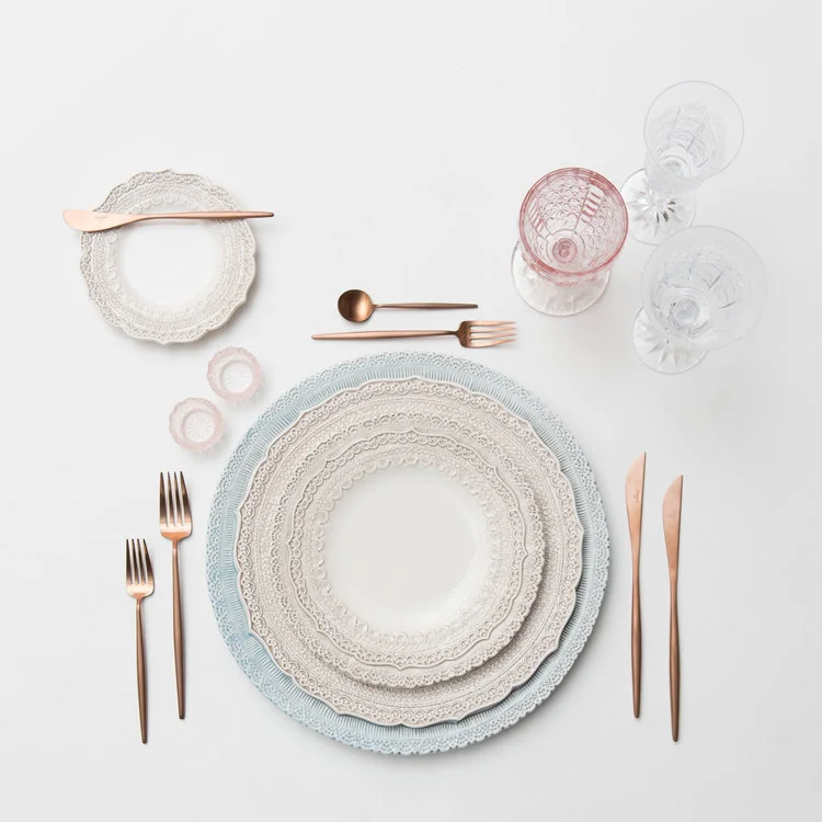
Pink has always been a go-to wedding color + it'll be exciting to see pink paired with blue in 2016 weddings. These colors will spark not only a rise in rose quartz + serenity, but all the different hues + shades surrounding. Soon, all the big name home decor stores will incorporate these colors + we, as designers + consumers, will have the say whether or not this choice was a hit or miss.
rose quartz + serenity styling mood board
Photo c/o Frieda Theres

